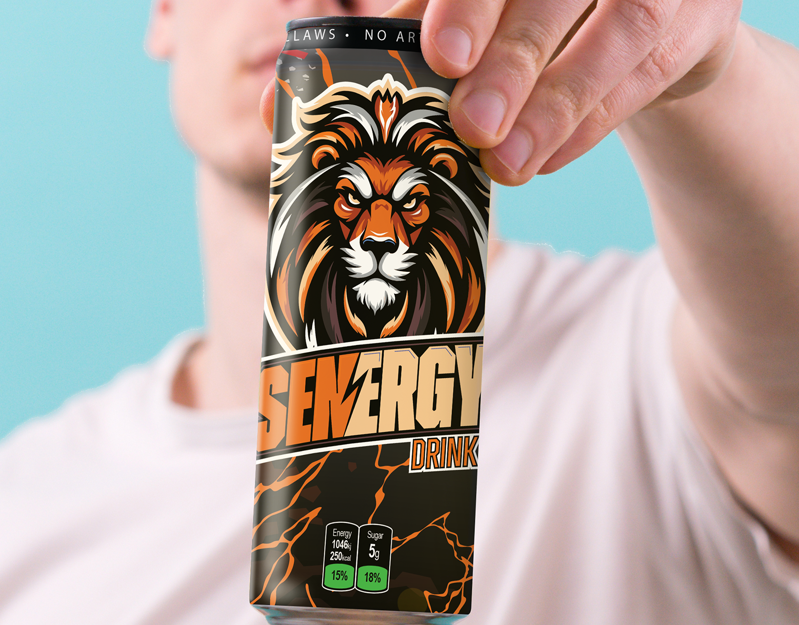
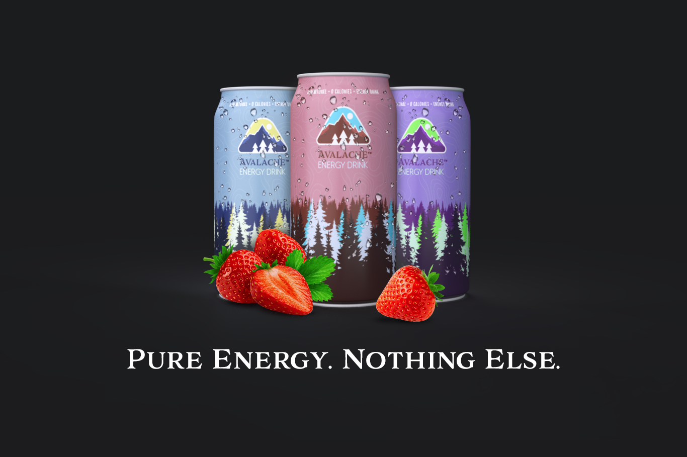
Avalache Energy Drink Concept
This conceptual piece was born from a simple "what if?" moment—after seeing a Starbucks Doubleshot ad, I wondered why a chocolate version didn’t exist. Driven by that curiosity, I decided to visualize the idea myself. I began by studying the original Starbucks can designs and recreating a custom concept in Adobe Illustrator that maintained brand authenticity while introducing a bold chocolate twist. Once the design was finalized, I transitioned into Adobe Dimension to bring the vision into 3D. Using carefully selected stock assets for the splash, ice cubes, and chocolate bars, I crafted a dynamic composition that captured the indulgent, high-energy feel of a premium coffee beverage.
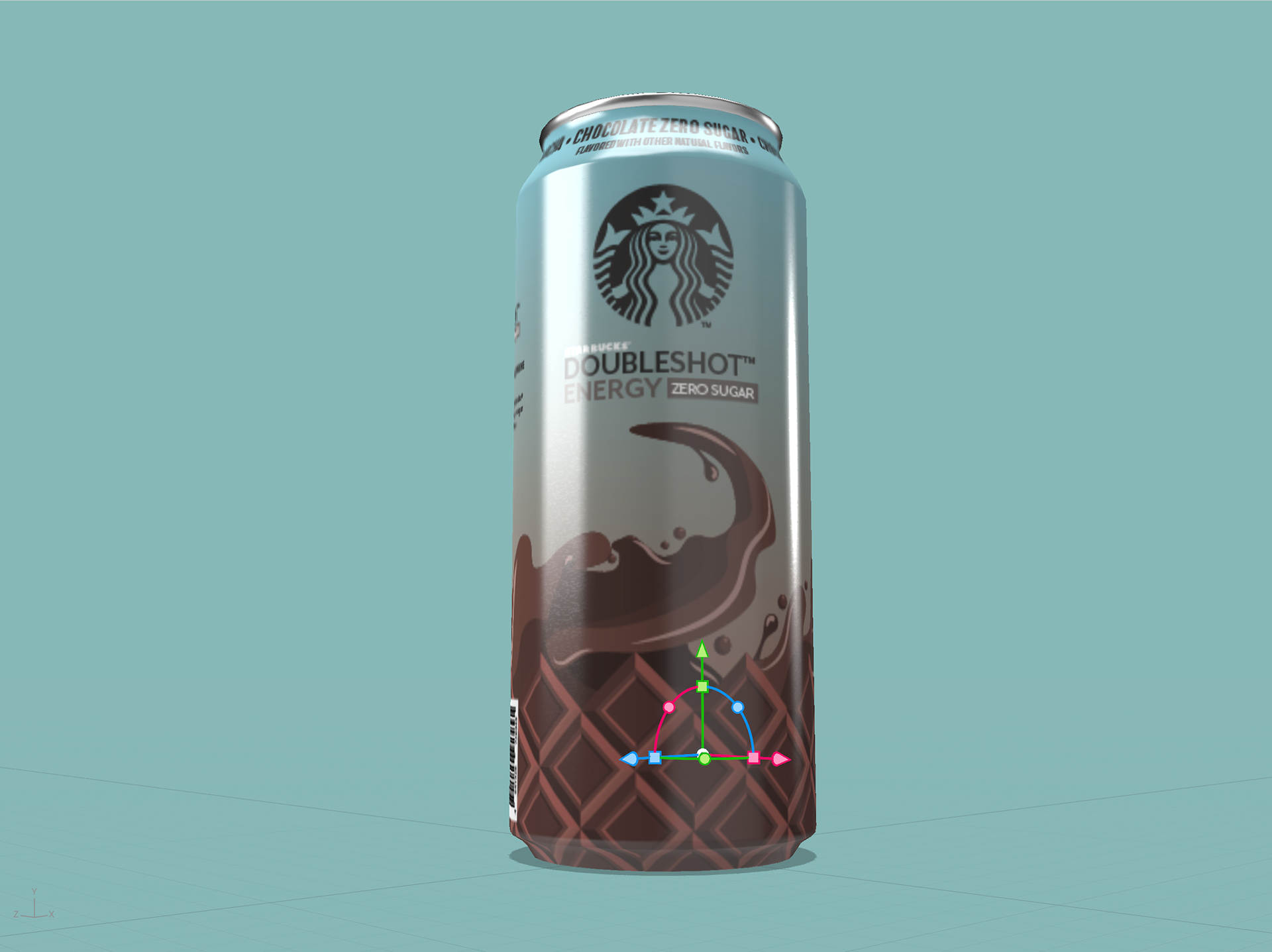
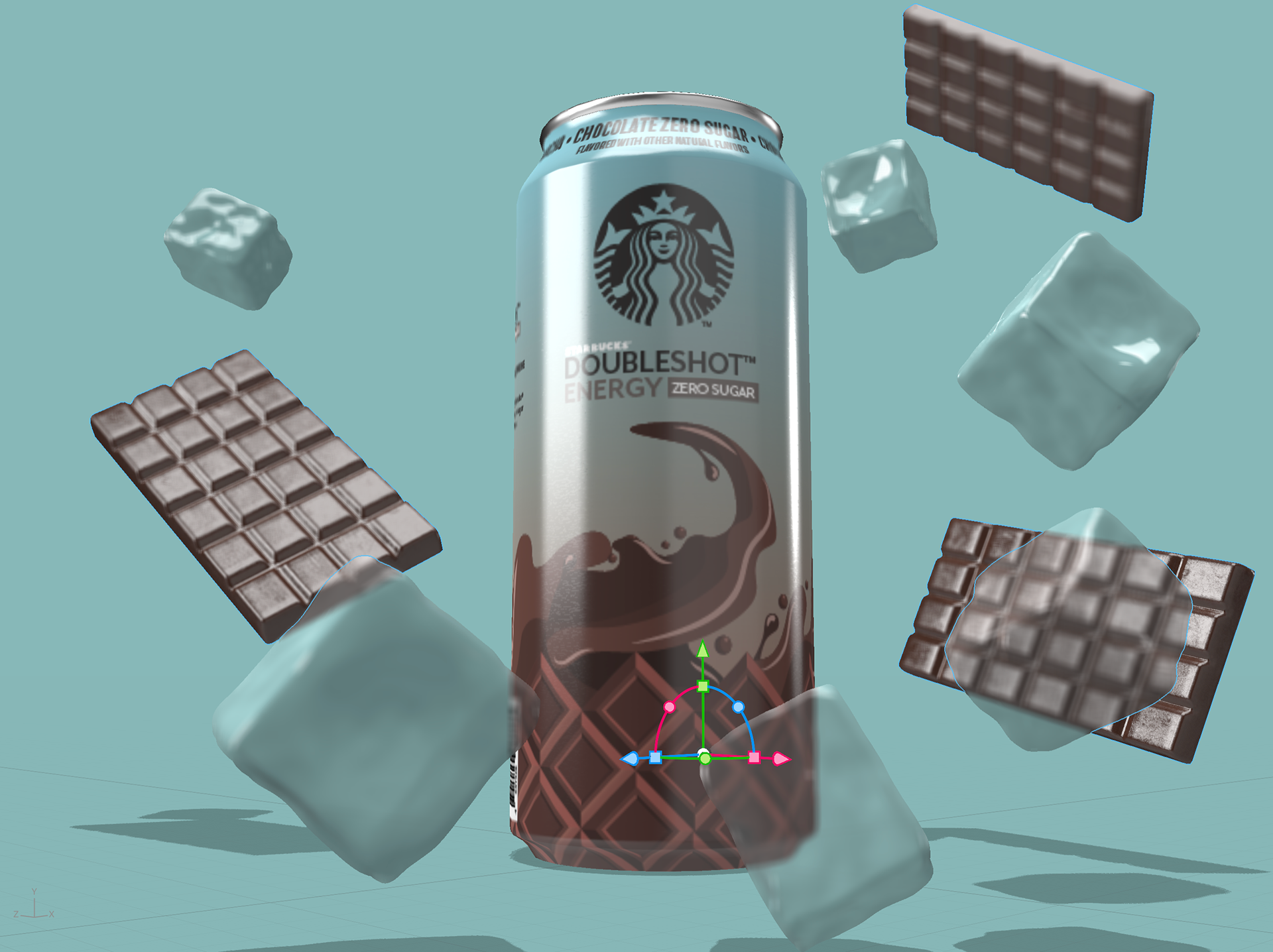


Starbucks Doubleshot Concept: Chocolate Edition
This conceptual piece was born from a simple "what if?" moment—after seeing a Starbucks Doubleshot ad, I wondered why a chocolate version didn’t exist. Driven by that curiosity, I decided to visualize the idea myself. I began by studying the original Starbucks can designs and recreating a custom concept in Adobe Illustrator that maintained brand authenticity while introducing a bold chocolate twist. Once the design was finalized, I transitioned into Adobe Dimension to bring the vision into 3D. Using carefully selected stock assets for the splash, ice cubes, and chocolate bars, I crafted a dynamic composition that captured the indulgent, high-energy feel of a premium coffee beverage.
After rendering the scene, I brought the artwork into Adobe Lightroom for post-processing, where I fine-tuned the saturation and contrast to amplify the product’s appeal and give it that clean, high-impact commercial finish. This project showcases my full-stack approach to design—from concept ideation and visual branding to 3D visualization and final post-production—while also reflecting my love for exploring what could be in the world of product innovation.
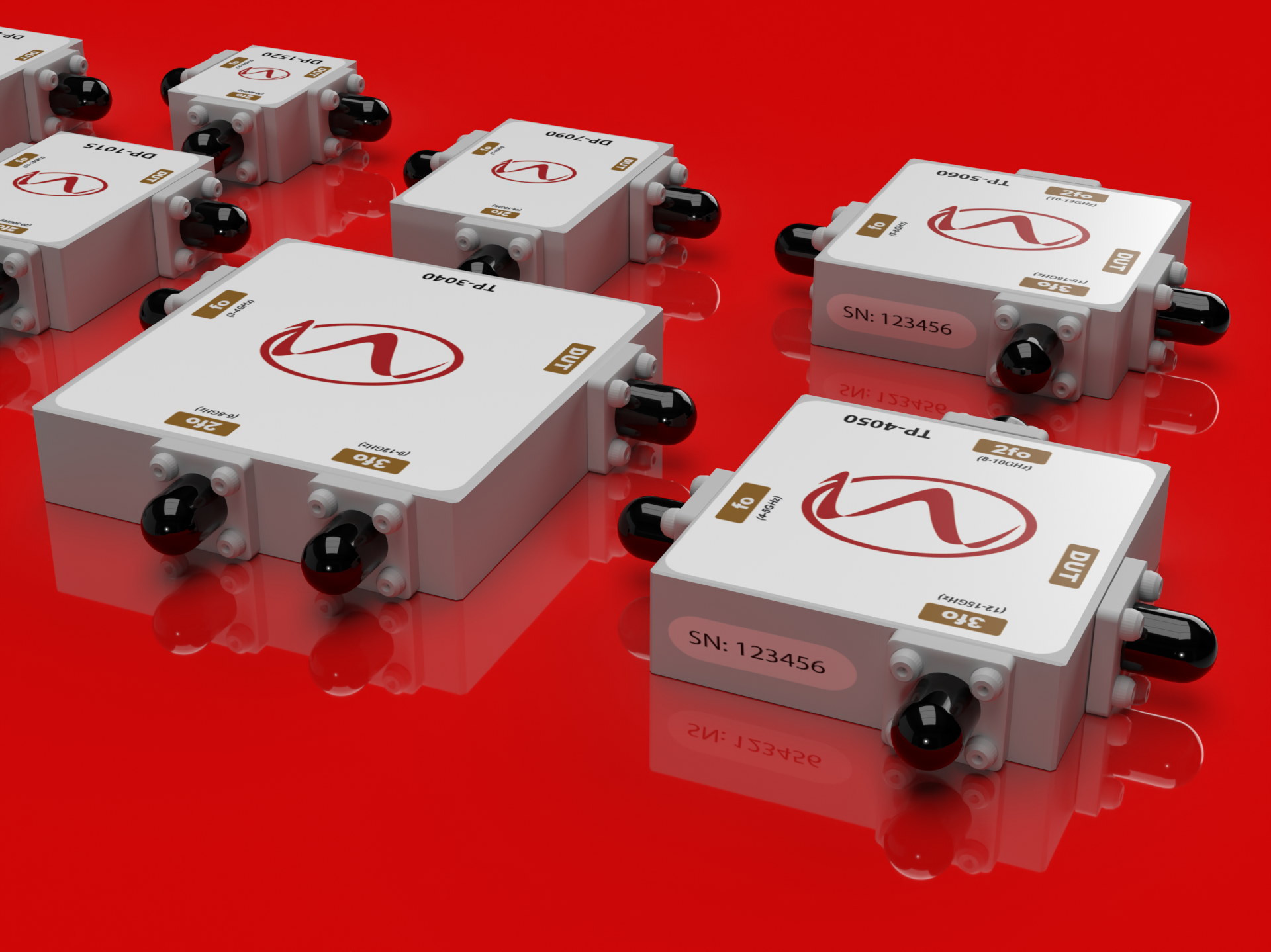
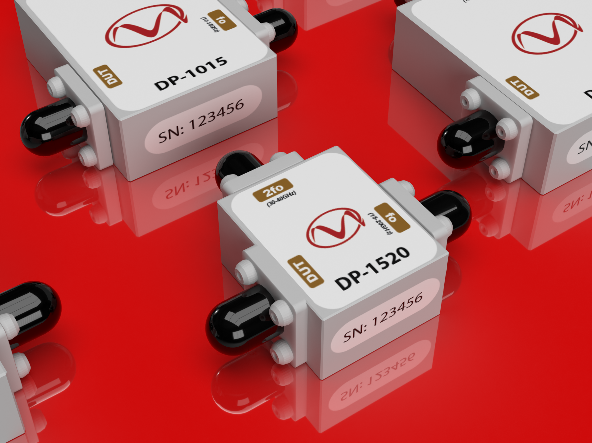
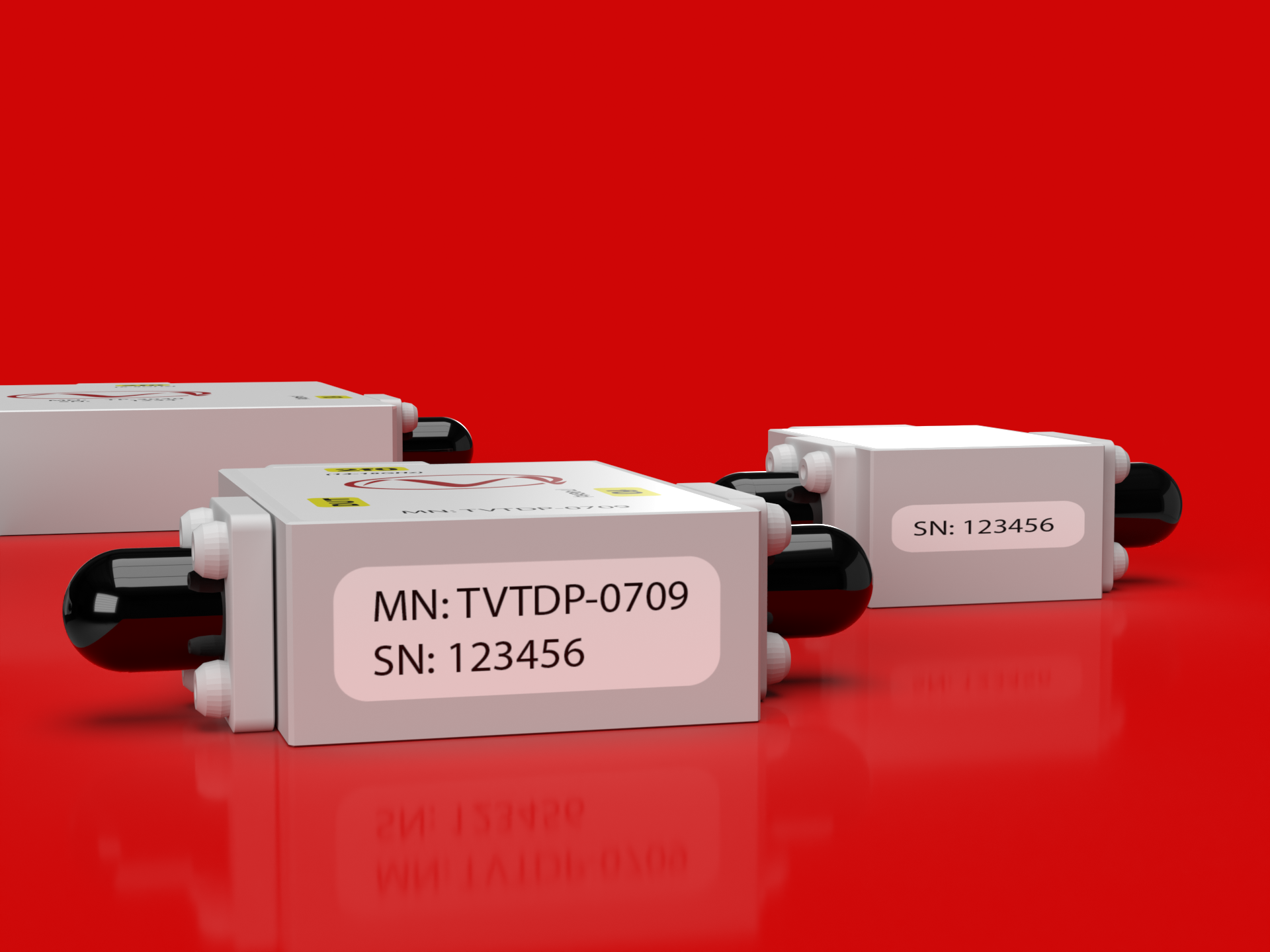
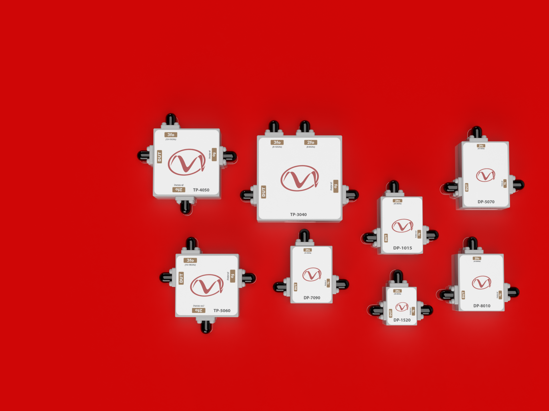
Multiplexer Label Redesign & Visualization
This project began as a solution to a functional design flaw—the original labels for the company’s multiplexer products placed serial and model numbers in locations that were difficult to read during installation and inspection. I was tasked with creating a more intuitive labeling system. My approach involved relocating the key identifiers to the side panels and introducing a clear, color-coded system to make each model instantly recognizable. These changes not only improved usability but also modernized the overall visual identity of the product line.
To help communicate the new design effectively, I created 1:1 scale 3D mock-ups using Adobe Dimension and Illustrator. These high-fidelity visuals were instrumental in aligning internal stakeholders and later served as official assets in the company’s product catalog and marketing brochures. This project underscores the importance of thoughtful design not just for aesthetics, but for real-world functionality and customer clarity.